Happy Friday everyone! Today’s EvoLiteracy News include: First, a behavioral study suggesting that blue whales might lack the innate behavioral repertoire to avoid collisions with cargo ships; after all, ships are relatively new, strange objects in the oceans, in contrast to the millions-of-years of whale evolutionary history in pristine environments. Second, a very important analysis on why scientist should avoid using bar-graphs to report data and, instead, go for more compelling alternatives for data depiction in scientific journals. And third, a super simple, yet powerful video on how to interpret population pyramids. Enjoy! — GPC.
Blue whales have limited behavioral responses for avoiding collision with large ships. Published in Endangered Species Research.
Why do blue whales not avoid collisions with cargo ships by simply swimming away or deep diving when danger approaches? It seems like the whales lack the behavioral repertoire to interpret the ships as danger; after all, cargo ships are new, foreign items in the whales’ natural environment; whales have evolved for millions of years without unnatural disturbances in the oceans. A new study by McKenna et al. (total five coauthors) brings some light into this problem, but clear-cut, definite answers are still needed.

Blue Whale – Illustration by Soul Pix
McKenna et al. summarize the research as follows: “Collisions between ships and whales are reported throughout the world’s oceans. For some endangered whale populations, ship strikes are a major threat to survival and recovery. Factors known to affect the incidence and severity of collisions include spatial co-occurrence of ships and whales, hydrodynamic forces around ships, and ship speed. Less understood and likely key to understanding differences in interactions between whales and ships is whale behavior in the presence of ships. In commercial shipping lanes off southern California, [the authors] simultaneously recorded blue whale behavior and commercial ship movement. A total of 20 ship passages with 9 individual whales were observed at distances ranging from 60 to 3600 m. [The researchers] documented a dive response (i.e. shallow dive during surface period) of blue whales in the path of oncoming ships in 55% of the ship passages, but found no evidence for lateral avoidance. Descent rate, duration, and maximum depth of the observed response dives were similar to whale behavior immediately after suction-cup tag deployments. These behavioral data were combined with ship hydrodynamic forces to evaluate the maximum ship speed that would allow a whale time to avoid an oncoming ship. [The authors’] analysis suggests that the ability of blue whales to avoid ships is limited to relatively slow descents, with no horizontal movements away from a ship. [The authors] posit that this constrained response repertoire would limit their ability to adjust their response behavior to different ship speeds. This is likely a factor in making blue whales, and perhaps other large whales, more vulnerable to ship strikes.” Open access to PDF of paper is available at ESR.
Should scientific journals request authors to change their practices for presenting continuous data in small sample size studies? An article in PLoS Biology recommends it.
This article is particularly important, it provides all of us with urgent advice on how to report statistical analyses (i.e. graphics of small samples) in our papers. Weissgerber et al. (total five authors) strongly recommend journal editors, authors and the scientific community to be more cautious when presenting results to readers, and here is why:
I will simplify the complexity of the Weissgerber et al. paper (although it is very friendly written) by addressing only what is substantial and eliminating the technicalities. However, readers might need to explore the content below with quality attention.
Let’s start by summarizing the authors’ abstract: “Figures in scientific publications are critically important because they often show the data supporting key findings… [As] scientists, we urgently need to change our practices for presenting continuous data in small sample size studies. Papers rarely [include] scatterplots, box plots, and histograms that allow readers to critically evaluate continuous data. Most papers [present] continuous data in bar and line graphs. This is problematic, as many different data distributions can lead to the same bar or line graph. The full data may suggest different conclusions from the summary statistics. [The authors] recommend training investigators in data presentation, encouraging a more complete presentation of data, and changing journal editorial policies…”
Weissgerber et al. (PLoS Biology 2015) examined 700 studies published in reputable physiology journals. They “focused on physiology because physiologists perform a wide range of studies, including human studies, animal studies, and in vitro laboratory experiments.” The authors found that 86% of the studies reported statistical analyses in bar graphs, which can be misleading, particularly when small samples are being measured. They explain this in three main figures. Below, I summarize the Weissgerber et al.’s images and text, plus include explanations in color to facilitate the interpretation of the material (remember that the original article can be downloaded from PLoS Biology).
First: fundamentally different data sets could lead authors to report the results [and statistics] in bar graphs and draw from them unwarranted conclusions.
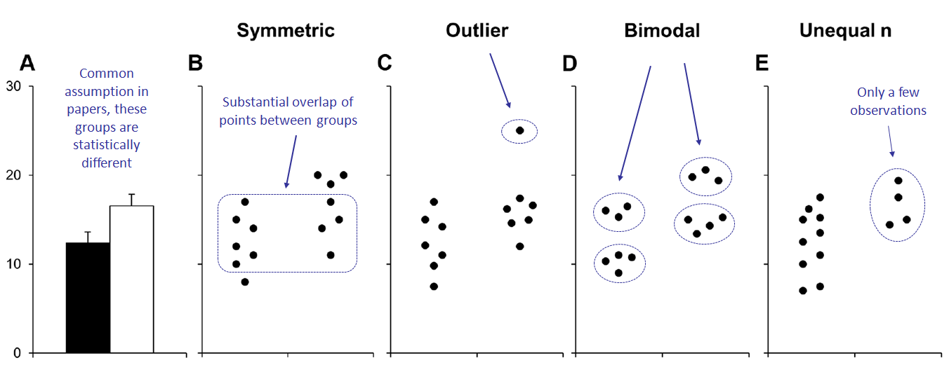
Adapted from Weissgerber et al. (PLoS Biology 2015). Click on image to enlarge.
Many different datasets can lead to the same bar graph, as depicted in the example of Panel A (above), a common practice in 86% of the scientific papers examined by Weissgerber et al. (PLoS Biology 2015). For instance, Panel A depicts two seemingly different groups, the black bar on the left is lower than the white bar on the right. Is this difference true and for the reasons we think?
The visualization of the full data (as depicted in Panels B, C, D and E) may suggest different conclusions as cautioned by Weissgerber et al. (PLoS Biology 2015).
Panel B: look how the data-point distributions in both groups appear symmetric. Although the data suggest a small difference between these groups, there is substantial overlap between groups (the position of many of the dots on the left clearly overlaps with the position of the dots on the right).
Panel C, the apparent difference between groups is driven by a single outlier.
Panel D suggests a possible bimodal distribution of the data points. Additional data are needed to confirm that the distribution is indeed bimodal and to determine whether this effect is explained by a covariate.
Panel E, the smaller range of values in group two (right) may simply be due to the fact that there are only a few observations (four data points). Additional data for group two would be needed to determine whether the groups are actually different.
Second: A common assumption in bar graphs is that the reported groups are not only different, but also independent. And that might not always be the case.

Adapted from Weissgerber et al. (PLoS Biology 2015). Click on image to enlarge.
Additional problems can emerge when using bar graphs to show paired data, as explained by Weissgerber et al. (PLoS Biology 2015):
The bar graph on Panel A (mean ± SE, where SE is Standard Error) suggests that the groups (black and white) are independent and provides no information about whether changes are consistent across individuals.
The scatterplots shown in the Panels B, C and D demonstrate that the data are paired, associated and not independent, as follows:
Panel B, data point values for every subject on the left group are higher on the right group (a one to one correspondence, they are closely associated).
Panel C, there are NO consistent differences between the two conditions (i.e. the data points, or “subjects,” on the left group behave erratically in respect to their counterparts on the right group: some lines go up, others go down, others are roughly horizontal, which indicates no clear pattern, nor close association between the groups).
Panel D suggests that there may be distinct subgroups of “responders” and “nonresponders.”
Third: Scatter plots are better alternatives to reporting data than bar graphs, particularly of small samples. And, using Standard Deviation lines, instead of Standard Errors, might be more informative to readers.
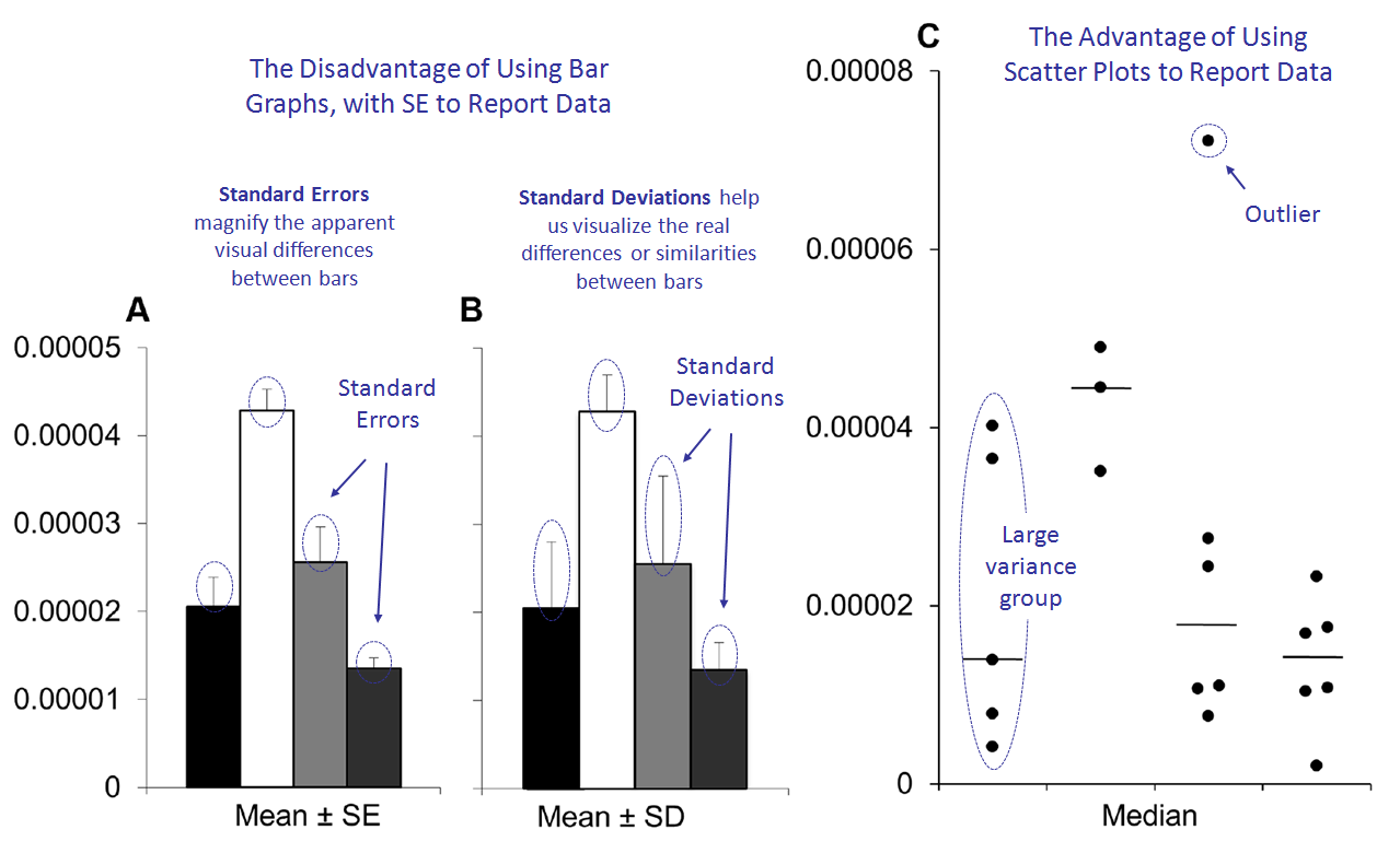
Adapted from Weissgerber et al. (PLoS Biology 2015). Click on image to enlarge.
Bar graphs and scatter plots convey very different information, as Weissgerber et al. (PLoS Biology 2015) explain:
Bar graphs discourage the reader from critically evaluating the statistical tests conducted in the analyses and the authors’ own interpretation of the data.
Panel A presents data in bar graphs showing mean values (the height of the bars) ± SE (Standard Errors, or the “T” shaped lines on top of the bars). Panel A suggests that the second group (white bar) has higher values than the remaining groups. But this might not be necessarily true because the Standard Errors measure only “the accuracy of the mean.” However, see what happens in Panel B (below).
Panel B presents data in bar graphs showing mean values ± SD (Standard Deviations, or the “longer T shaped lines” [in respect to those of Panel A] on top of the bars). Note that Panel B reveals that there is considerable overlap between groups (i.e. the horizontal projections of the “T” shaped lines overlap with one another). This is because Standard Deviations measure “the variation in the samples,” rather than the accuracy of the mean as in the case of the Standard Errors.
Thus, showing SE (Panel A) rather than SD (Panel B) magnifies the apparent visual differences between groups, and this is exacerbated by the fact that SE obscures any effect of unequal sample size.
Yet, Weissgerber et al. (PLoS Biology 2015) indicate that the scatter plot (Panel C) –a better alternative to A or B– clearly shows that the sample sizes are small in all groups, plus group one has a much larger variance than the other groups, and there is an outlier in group three. These problems are not apparent in the bar graphs shown in Panels A or B.
The complete article, supplementary materials, and companion Excel file to assist readers conduct similar analyses can be downloaded from PLoS Biology.
Video:
My video/animation of the day comes, again, from TED-Ed Originals on “Population Pyramids: Powerful Predictors of the Future.” I use this animation to explain to students the relevance of understanding basic data on population demography. The producers explain: “Population statistics… can help predict a country’s [demographic] future (and give important clues about the past). [A] population pyramid [can help] policymakers and social scientists make sense of [demographic] statistics by, [as discussed in the animation, analyzing different types of pyramids].”

You must be logged in to post a comment.